Hello everyone. You may or may not know that I have been doing a little maintenance around these parts. Let's call it "Fall Cleaning". I've been sorting and arranging and filing and organizing. It makes me feel better and it also looks better too! So, what am I talking about? Let me tell you.
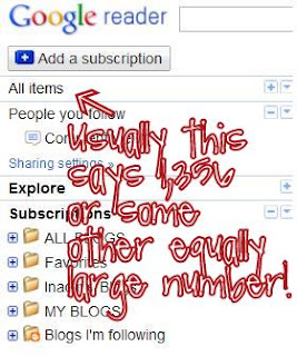
First up, I reorganized my Reader. I had WAAYY too many subscriptions and I didn't have time to read them all. Also, many of them were people who were doing the 365 Project at the same time as I was, and their blogs have been inactive for some time. So I went from 161 subscriptions to...71. Yup. It took some time, but I finally got down to ZERO posts, without "marking all as read" (I think I still have "people I follow" who are not counted in the "subscription" count, but I am not sure.)
Secondly, I have been working on some label buttons and they still aren't quite what I wanted but here they are anyway. These are a few of my favorite things. If you are reading this in Reader, you can click out to see them on my left sidebar, for now. Or, if you click on them, it will take you to the appropriate topic. Tell me, do you think it is too busy over on that side?
I also created "Find Me Here" buttons, although I am not really sure how I feel about them either. I would rather have the logo from whatever site it is, but I am not savvy enough to do that, so I just made my own the only way I know how. Where do you guys find the P, the F, the envelope and the little bird?
To top it off, and to try to get rid of some of the busyness, I changed the background to a solid color. Is it TOO white?
I would appreciate any feedback, tips and comments!
Do you change your look often? Do you ever go through and "clean up"? How do you keep your blog looking fresh?


I like the buttons and the white background! I don't think it's too white - rather, it looks clean and tidy. I clean up my blog every so often, and go through my reader to weed out blogs that I no longer read for whatever reason a couple of times a year.
ReplyDeleteI like the white background! Not to white at all. I think it looks clean and simple. I am always drawn more to that myself! I love your connect buttons as well!
ReplyDeleteI think it looks great. I read most blogs in my reader, so I don't always see the layouts. I try to weed through my reader frequently, too. You can find the Twitter and FB buttons on their websites, usually there's a menu item of widgets where you can get the code.
ReplyDeleteHa, I need to go through my reader too. I have well over 100 subscriptions! Yikes!
ReplyDeleteI really like the buttons and white background. If you want to change the "find me here" buttons, just Google image search "social media icons" and you'll get tons of hits with images you can use.
I like it! It looks really clean and fresh! I haves way too many subscriptions to keep up with, maybe I will clean it up this winter.
ReplyDeleteYou've been busy. I like the buttons and the white works well with the added images without being too much.
ReplyDeleteI like to make small changes often and big changes every now and then. Actually, I want to make a huge change and move to blogger or wordpress but quickly become frustrated at how difficult it is to move from TypePad.
How did you create the Find Me Here buttons? Similar to the label buttons?
I love it! Beautiful!
ReplyDeleteI've been thinking about clearing out some of my subscriptions too...they really pile up quickly!
I go through and clean up my subscriptions once in awhile.
ReplyDeleteAs for the Twitter and Facebook, etc, buttons, I just did an image search for social networking buttons and downloaded the ones I liked, then uploaded those files to photobucket, grabbed the html codes, added in the link to my own pages and added the buttons in an html gadget on my sidebar.
Easy peasy. :-)